Inferring phases
Examples of how to infer phases with Phasik can be found on the gitlab repository, for example notebook 1_c_Infer_phases_by_clustering_snapshots.
>>> import matplotlib.pyplot as plt
>>> import networkx as nx # for the static network
>>> import numpy as np
>>> import pandas as pd # for the temporal data
>>> # import Phasik
>>> import phasik as pk
Building the temporal network
First, we generate an example static network
>>> edges = [('a', 'b'), ('a', 'c'), ('b', 'c'), ('a', 'd')]
>>> static_network = nx.Graph(edges)
Second, we generate example time series for the nodes
>>> nodes = list(static_network.nodes)
>>> N = static_network.number_of_nodes()
>>> T = 10 # number of timepoints
>>>
>>> node_series_arr = np.random.random((N, T)) # random time series
>>> node_series = pd.DataFrame(node_series_arr, index=nodes)
Finally, we generate the temporal network
>>> # create the temporal network by combining
>>> # the static network with the node timeseries
>>> temporal_network = pk.TemporalNetwork.from_static_network_and_node_timeseries(
...     static_network,
...     node_series,
...     static_edge_default_weight=1,
...     normalise='minmax', # method to normalise the edge weights
...     quiet=False # if True, prints less information
... )
Inferring phases
Set the parameters for the phase inference
>>> distance_metric = 'euclidean' # used to compute distance between snapshots
>>> clustering_method = 'ward' # used to compute the distance between clusters
>>> n_max_type = 'maxclust' # set number of clusters by maximum number of clusters wanted
>>> n_max = 3 # max number of clusters
>>> n_max_range = range(2,6) # range of numbers of clusters to compute
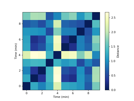
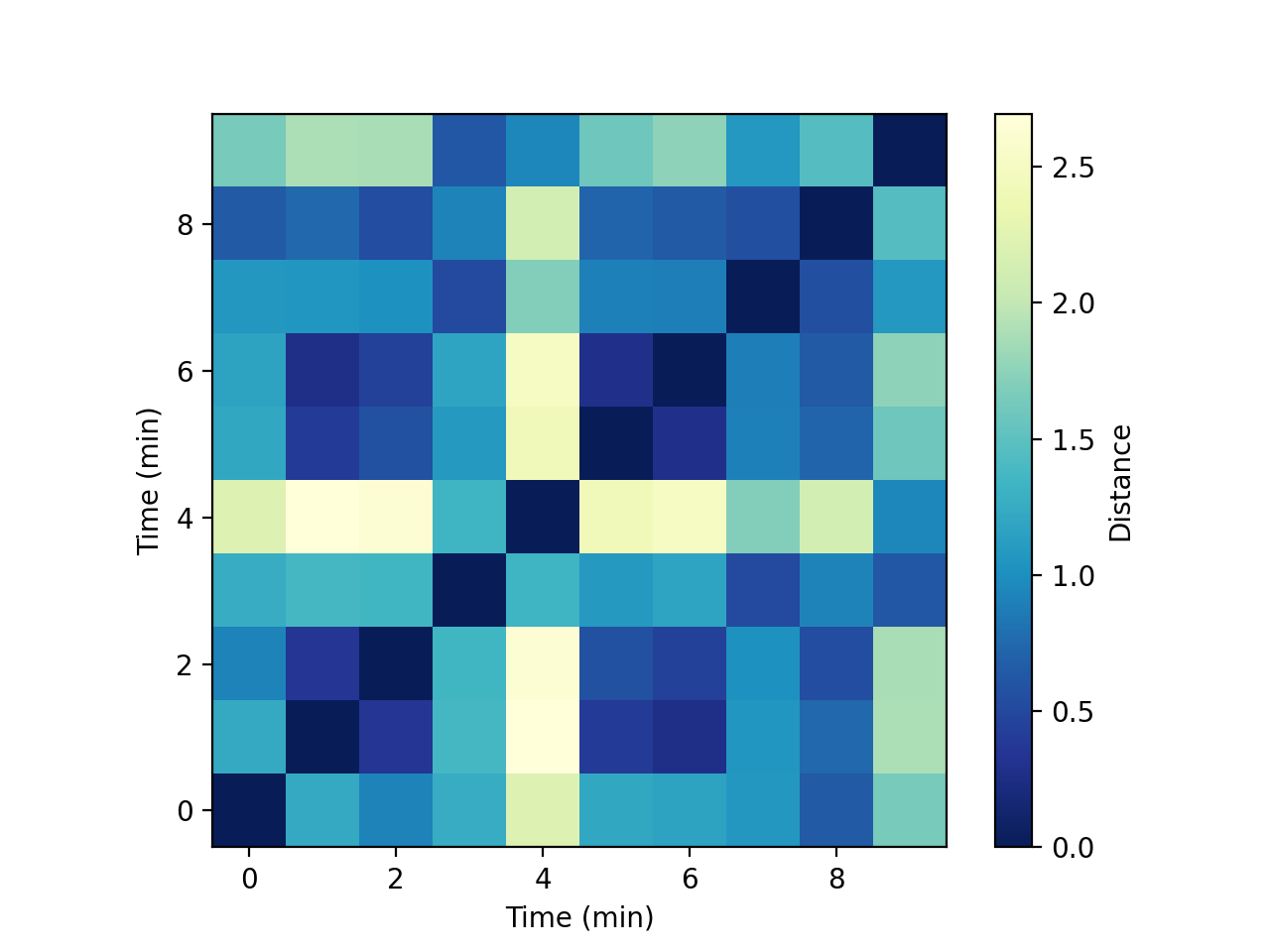
First, compute the distance matrix between snapshots, from the temporal network:
>>> distance_matrix = pk.DistanceMatrix.from_temporal_network(temporal_network, distance_metric)
Plot this distance matrix :
>>> fig, ax = plt.subplots()
>>>
>>> im = ax.imshow(distance_matrix.distance_matrix, aspect="equal", origin="lower", cmap="YlGnBu_r")
>>>
>>> ax.set_ylabel("Time (min)")
>>> ax.set_xlabel("Time (min)")
>>>
>>> cb = fig.colorbar(im)#, cax=cax)
>>> cb.set_label("Distance")
>>>
>>> plt.show()

Second, compute a cluster set with a given number of clusters ‘n_max’:
>>> cluster_set = pk.ClusterSet.from_distance_matrix(distance_matrix, n_max_type, n_max, clustering_method)
>>> fig, ax = plt.subplots(figsize=(7, 1))
>>>
>>> cluster_set.plot(ax=ax, y_height=0)
>>>
>>> ax.set_aspect(10)
>>> ax.set_yticks([])
>>> ax.set_xlabel("Time (min)")
>>> plt.tight_layout()
>>> plt.show()

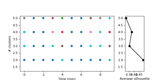
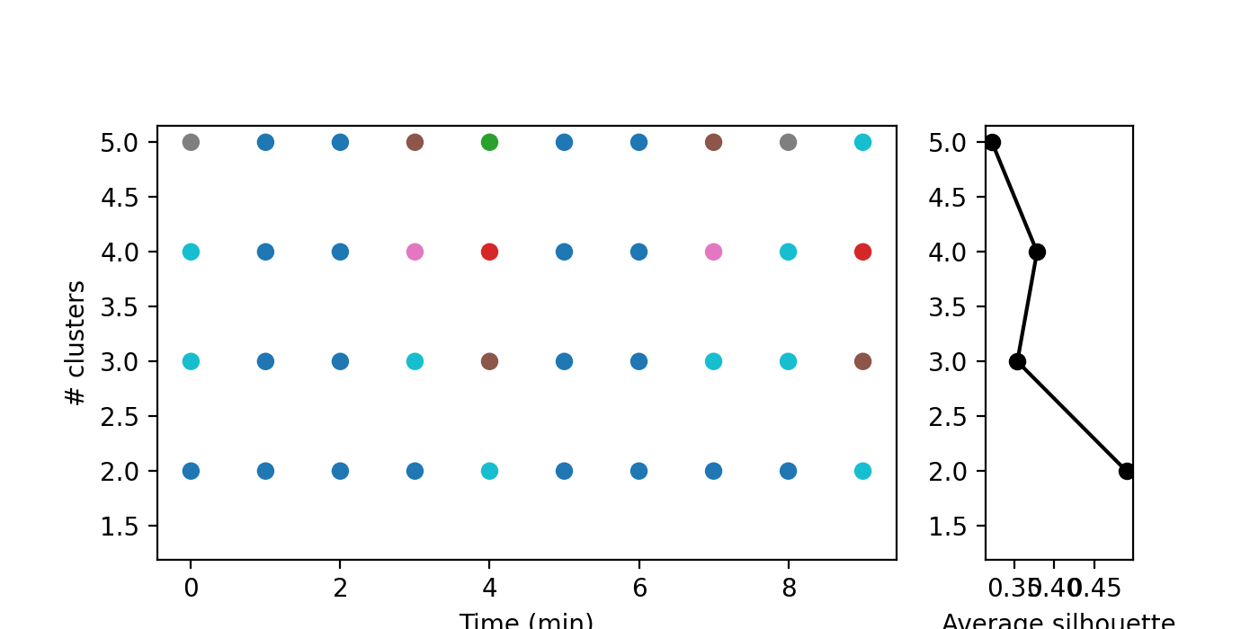
We can also compute a range of numbers of clusters
>>> cluster_sets = pk.ClusterSets.from_distance_matrix(distance_matrix, n_max_type, n_max_range, clustering_method)
and plot them as follows, with the associated silhouette scores:
>>> gridspec_kw = {"width_ratios": [5, 1]}
>>> fig, (ax1, ax2) = plt.subplots(1, 2, figsize=(7, 3.5), gridspec_kw=gridspec_kw, sharey='all')
>>>
>>> cluster_sets.plot(axs=(ax1, ax2), with_silhouettes=True)
>>> pk.adjust_margin(ax=ax1, bottom=0.2)
>>>
>>> ax1.set_xlabel("Time (min)")
>>> ax1.set_axisbelow(True)
>>> ax1.set_ylabel("# clusters")
>>>
>>> ax2.set_xlabel("Average silhouette")
>>> ax2.yaxis.set_tick_params(labelleft=True)
>>>
>>> plt.subplots_adjust(wspace=0.2, top=0.8)
>>> plt.show()